Fonts and typography in logos
The choice of font is a crucial element in logo design, as it plays a significant role in conveying the essence of your brand. Typography is not just about selecting a stylish or trendy typeface; it’s about choosing a font that aligns with your brand’s identity, values, and message. In this article, we’ll explore how to choose the right typeface for your logo and why typography is so important in brand design.
1. Understanding the Role of Typography in Logos
Typography in logo design is more than just letters; it's a visual representation of your brand's personality. The font you choose can evoke emotions, create associations, and communicate your brand’s message at a glance. For instance, a serif font might convey tradition and reliability, while a sans-serif font can suggest modernity and simplicity.
Key Considerations:
- Brand Personality: What traits does your brand embody? Is it professional, playful, innovative, or trustworthy? Your font choice should reflect these characteristics.
- Target Audience: Who are you trying to reach? Different demographics may respond better to different typographical styles.
- Industry Standards: While it’s important to stand out, aligning with industry norms can also be beneficial. For example, tech companies often use clean, sans-serif fonts to convey a forward-thinking image.
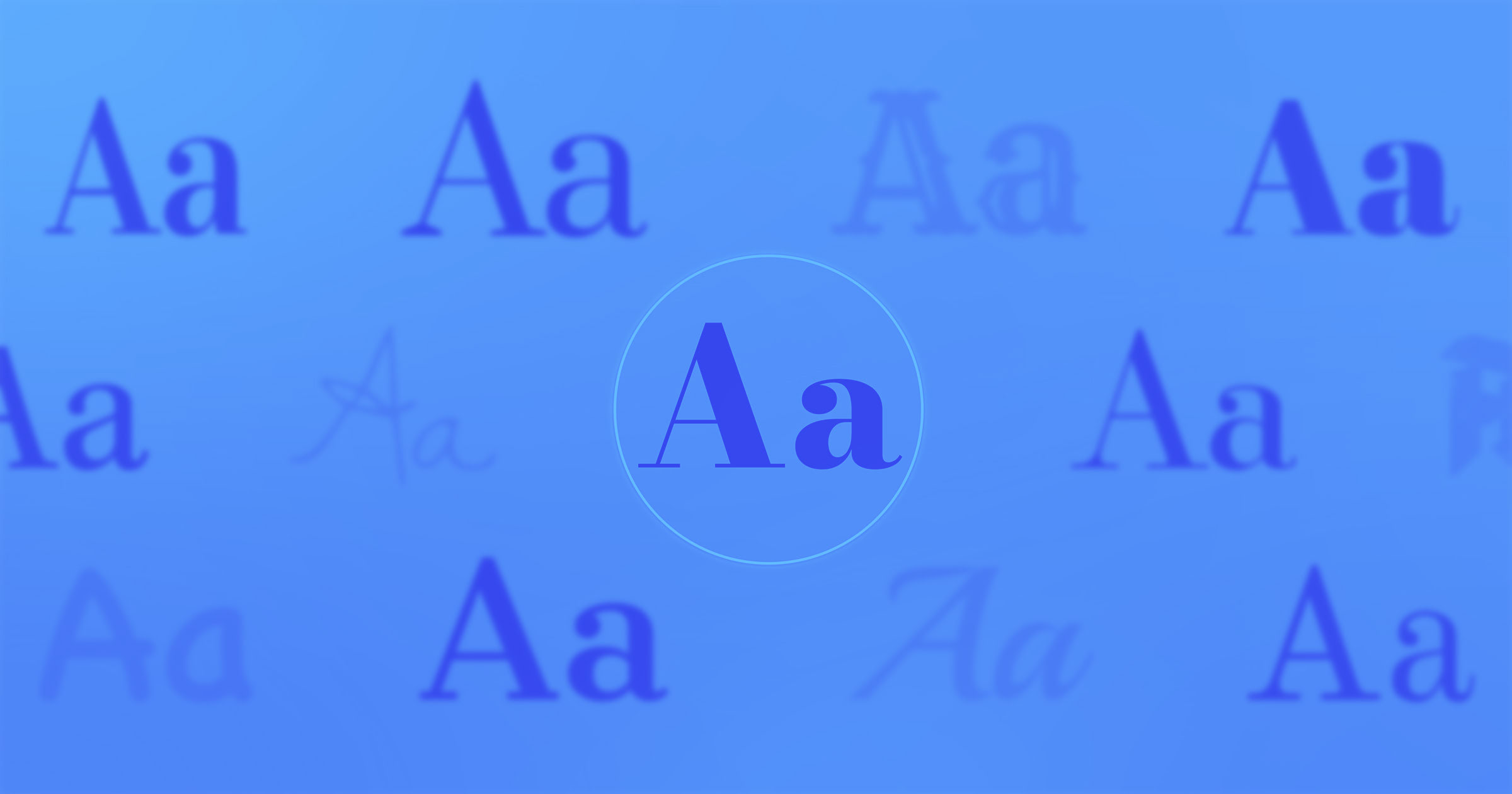
2. Types of Fonts and Their Impact
There are several main categories of fonts, each with its own connotations and suitable use cases:
Serif Fonts: These fonts have small lines or embellishments at the end of each letter stroke. They are often associated with tradition, authority, and sophistication. Brands that wish to appear reliable and established may opt for a serif font in their logo (e.g., Times New Roman, Garamond).
Sans-Serif Fonts: Sans-serif fonts lack the embellishments found in serif fonts, offering a cleaner, more modern look. They are often used by brands that want to appear contemporary, straightforward, and accessible (e.g., Helvetica, Arial).
Script Fonts: Script fonts mimic cursive handwriting and are often used to convey elegance, creativity, or a personal touch. They are popular in industries like fashion, beauty, and luxury goods (e.g., Pacifico, Lobster).
Display Fonts: These are unique and decorative fonts designed to stand out. They are often used for brands that want to make a bold statement or have a distinctive, memorable logo (e.g., Cooper Black, Impact).
Tip: Choose a font that not only looks good but also fits the message you want to convey. It’s important to balance aesthetics with functionality.
3. Combining Fonts: Harmony and Contrast
In some cases, using more than one font in a logo can be effective, particularly if you want to emphasize different aspects of your brand. However, it’s crucial to strike a balance between harmony and contrast.
Harmony: Fonts should complement each other without clashing. Similar styles or typefaces from the same family can create a cohesive look.
Contrast: Using contrasting fonts can draw attention to specific words or elements within your logo. For instance, pairing a bold sans-serif font with a delicate script font can create an interesting visual dynamic.
Tip: Limit your logo to two fonts at most to avoid visual clutter. Test different combinations to find the perfect balance between harmony and contrast.
4. Legibility and Scalability
A beautiful font is meaningless if it’s not legible or scalable. Your logo will be used in various sizes and formats, from business cards to billboards, so the typography must remain clear and readable in all contexts.
Key Considerations:
- Legibility: Choose a font that is easy to read, even at small sizes. Avoid overly intricate or decorative fonts that may become illegible when scaled down.
- Scalability: Ensure that your logo maintains its integrity when resized. The typography should look sharp and clear whether it’s on a small product label or a large outdoor sign.
Tip: Test your logo at different sizes and in different formats to ensure it remains effective and legible.
5. Custom Fonts: Creating a Unique Identity
For brands looking to stand out, custom fonts offer a way to create a truly unique logo. Custom typography allows you to design a typeface that is perfectly aligned with your brand’s identity and message, setting you apart from competitors who use off-the-shelf fonts.
Pros of Custom Fonts:
- Uniqueness: A custom font can make your logo instantly recognizable and memorable.
- Brand Alignment: You have complete control over the design, ensuring that the typography perfectly reflects your brand’s personality.
Cons of Custom Fonts:
- Cost: Designing a custom font can be expensive and time-consuming.
- Versatility: Custom fonts may not always be versatile enough for other brand materials or marketing campaigns.
Tip: If budget allows, consider working with a professional typographer to create a custom font that enhances your brand’s identity.
6. Trends vs. Timelessness
While it can be tempting to choose a font based on current design trends, it’s essential to consider the longevity of your logo. Trends come and go, but your logo should remain relevant for years to come. A timeless typeface can ensure that your logo doesn’t quickly become outdated.
Tip: Opt for a font that balances modernity with timeless appeal. Avoid overly trendy fonts that may lose their appeal as design trends evolve.
Typography is a powerful tool in logo design, capable of shaping how your brand is perceived by the world. By carefully selecting a font that aligns with your brand’s identity, resonates with your audience, and remains functional across all mediums, you can create a logo that is both effective and memorable. Remember, the right typeface is more than just a design choice—it’s a strategic decision that can impact the success of your brand.