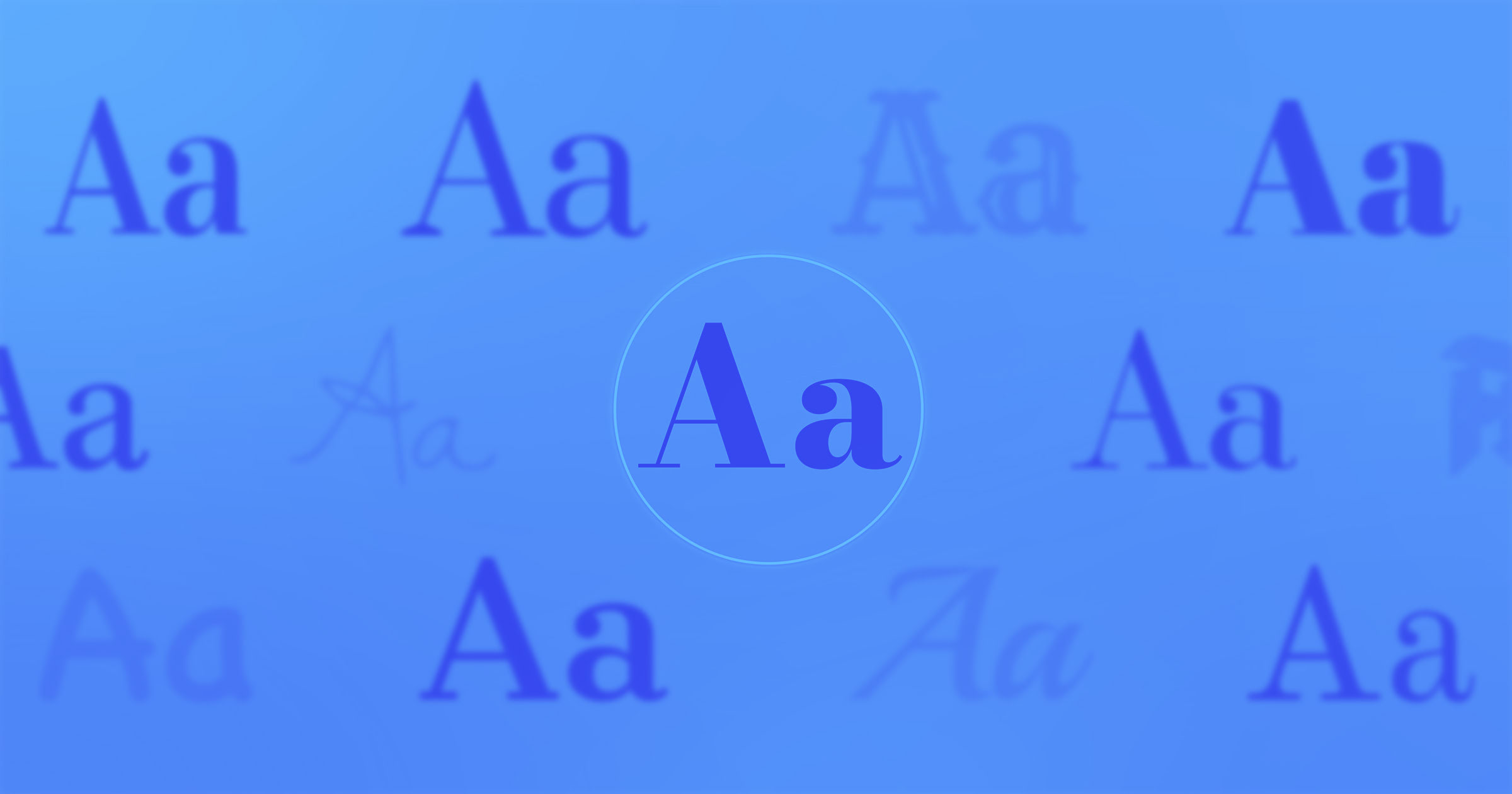
The choice of colors when creating a logo and the importance of colour.
In the process of
creating a logo, one of the important stages is the choice of colour. According
to statistics, the first thing a buyer pays attention to is the logo's colour,
and in 60% of cases, this factor influences his choice. By paying attention to
the meanings and unique aura of each color, you can create the perfect logo for
yourself. The presented article contains interesting information about colours
for you.
1. Color meanings and impact on the client.
1.1. Red.
Red colour is
primarily strength, youth, confidence, speed. Due to its strong effect on the
human nervous system, red is used for dynamics or to quickly attract the
client’s attention. Fast food outlets, gyms or energy drinks - red is most
often used in these areas.
1.2. Black.
Black is an
indicator of luxury, sophistication and quality. Typically, brands that prefer
black in their logos are aimed at an audience that values luxury and
sophistication. Most often, black is used with black, creating a monochrome
picture.
1.3.White.
Purity, innocence
and freshness are concepts associated with this colour. Being a neutral colour,
it is usually used as a background to highlight other colours. Technology
companies, healthcare and luxury brands usually prefer white.
1.4.Yellow.
Happiness,
optimism, joy are signs that characterize the color yellow. Like red, it also
calls the client to action and is used in the children's services, food and
automotive industries. It is no coincidence that the large fast food chain
McDonald's used red and yellow in creating its logo, colours that call the
client to action and dynamics.
1.5.Green.
Green is an
indicator of harmony, balance, calmness and health. If you want to make your
logo light but not busy, then green as a neutral colour is an excellent choice
for you. Medicine, eco-products and cosmetology are areas in which green is
used most often.
1.6.Blue.
Although blue is
a cool colour, it calms, clarifies thoughts and acts as a symbol of confidence.
Finance, legal, technology and banking services are the areas where this light
is most often preferred. If your main goal is to gain the client's trust, be
sure to use blue.
2. Colour combinations.
Logos consisting
of several elements usually combine several colours that must match each other.
In color science, such concepts as “cold-hot” colours will help you choose colours
that combine with each other. Also, in the public domain, there are colour
combination schemes that will help you in choosing them.
Based on the information presented above, it can be
clearly understood that colours, even without us realizing it, affect us and
our psychology. By keeping all the information presented in mind, you will be
at your best and will be able to create the perfect logo for you.