CSS: Basics and principles of cascading style sheets
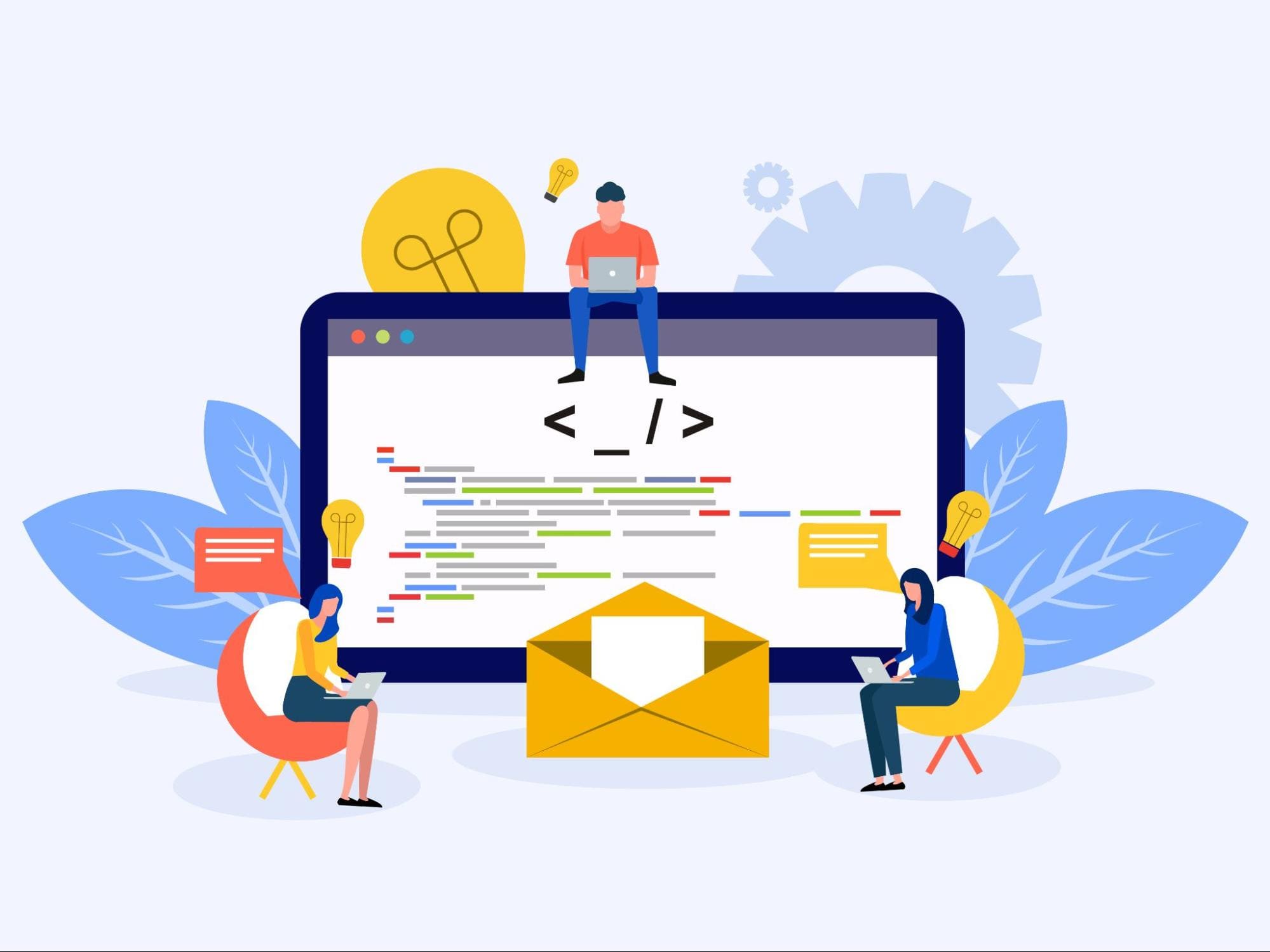
CSS (Cascading Style Sheets) is a language used to describe the presentation and formatting of web pages. CSS plays a key role in modern web design, allowing developers to separate the content (HTML) from the visual styling of a page. In this article, we'll explore the fundamental concepts, principles, and important aspects of CSS.
CSS Basics
CSS is used to define the styles for HTML elements, such as text, images, blocks, and other components of a web page. With CSS, you can set colors, fonts, margins, borders, animations, and many other visual aspects.
Selectors: In CSS, selectors are used to determine which HTML elements will be styled. Selectors can be based on tags, classes, IDs, or element attributes.
- Tag Selector: Applies a style to all elements of a specific type, such as all paragraphs (
p { color: blue; }). - Class Selector: Applies a style to elements with a specific class (
.class-name { color: green; }). - ID Selector: Applies a style to an element with a specific ID (
#id-name { color: red; }).
- Tag Selector: Applies a style to all elements of a specific type, such as all paragraphs (
Properties and Values: CSS consists of property-value pairs. Each property controls a specific aspect of an element's styling.
- Example:
color: blue;is thecolorproperty with the valueblue, which changes the text color.
- Example:
CSS Principles
Cascading: One of the most important principles of CSS is cascading, which means that styles are applied based on their order, specificity, and origin.
- Order: If multiple styles apply to the same element, the last one in order takes precedence.
- Specificity: Styles defined with higher specificity have priority over less specific ones. For example, an ID selector is more specific than a class selector.
Inheritance: Many CSS properties are inherited by child elements from their parent elements. This simplifies applying styles to large sections of a page.
- Example: If you set the text color for the
<body>element, this color will be inherited by all elements within<body>unless they have their own color values.
- Example: If you set the text color for the
Block and Inline Model: In CSS, there are two main types of elements: block and inline.
- Block Elements: Take up the full width of their parent element and start on a new line. Examples include
<div>and<p>. - Inline Elements: Take up only the width necessary for their content and do not start on a new line. Examples include
<span>and<a>.
- Block Elements: Take up the full width of their parent element and start on a new line. Examples include
Flexbox: Flexbox is a powerful tool for creating flexible layouts. Flexbox simplifies aligning elements within a container and distributing free space.
- Example: Using
display: flex;on a container makes it a flexbox container, and its child elements become flex items.
- Example: Using
Grid Layout: CSS Grid is another tool for creating complex layouts. Unlike Flexbox, which works in one direction (either rows or columns), Grid allows you to create two-dimensional layouts.
- Example: Using
display: grid;on a container allows you to define rows and columns, then place elements in specific areas of the grid.
- Example: Using
Advanced CSS Techniques
Pseudo-classes and Pseudo-elements: These tools allow you to apply styles based on an element's state or part of an element.
- Pseudo-classes: Apply to elements based on their state, such as
:hoverfor changing the style when the mouse hovers over an element. - Pseudo-elements: Apply to part of an element, such as
::beforeor::afterfor inserting content before or after the element's content.
- Pseudo-classes: Apply to elements based on their state, such as
Animations and Transitions: CSS allows you to create smooth animations and transitions between different states of elements.
- Transitions: Allow you to smoothly change CSS property values when certain events occur, such as
transition: all 0.3s ease;. - Animations: Used to create complex animation effects using keyframes (
@keyframes).
- Transitions: Allow you to smoothly change CSS property values when certain events occur, such as
Responsive Design: Responsive web design is achieved through media queries (
@media), which allow you to change styles based on screen width and other device characteristics.- Example:
@media (max-width: 768px) { ... }— applies only when the screen width is 768 pixels or less.
- Example:
CSS is a powerful tool for creating beautiful and functional web pages. It provides flexible options for styling elements, creating complex layouts, and improving the user experience. Knowledge of the basics and principles of CSS is an essential skill for every web developer and designer. With CSS, you can create unique and attractive interfaces that are adapted for different devices and screens, making it an indispensable part of modern web design.

